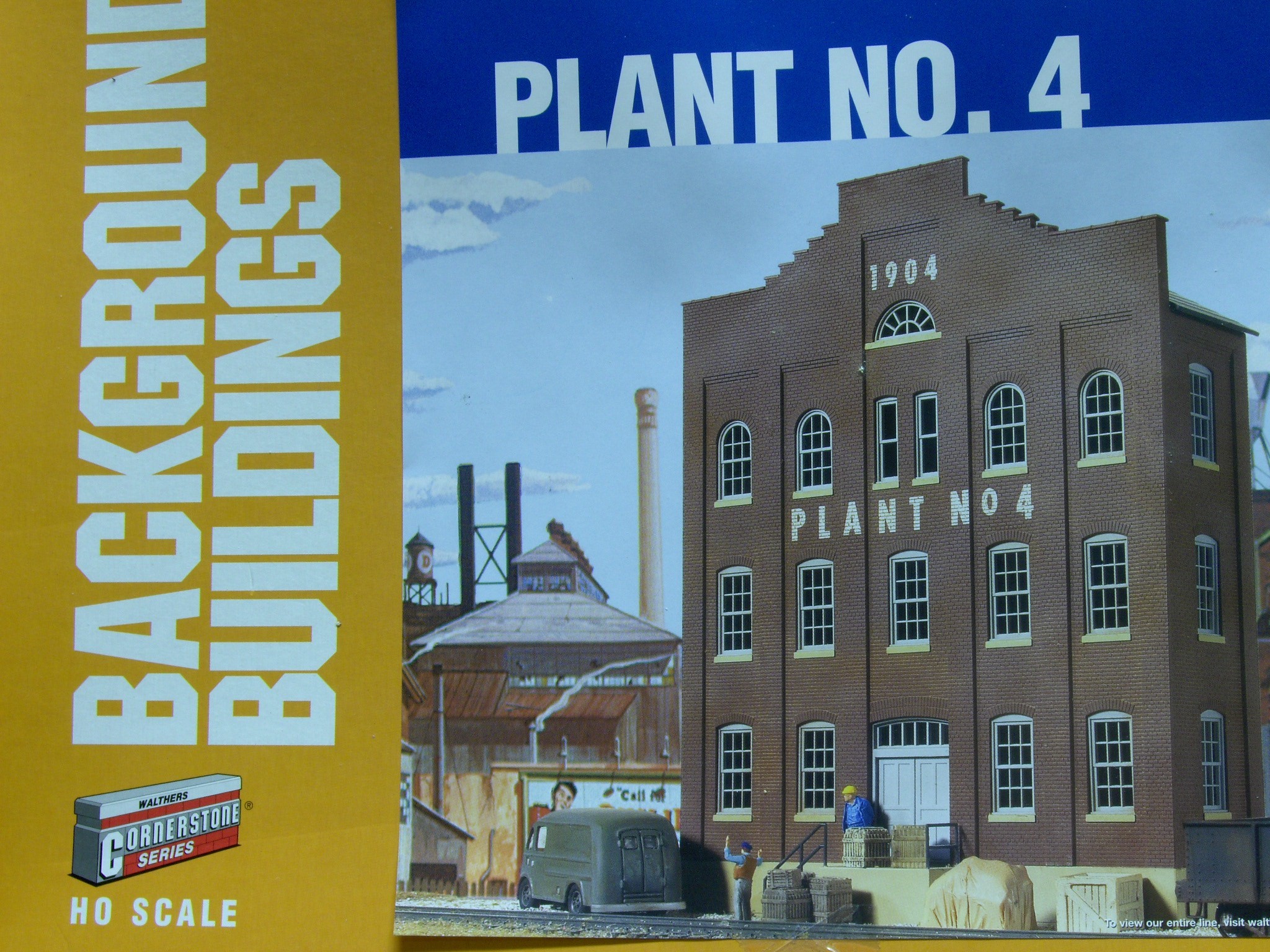
Here is another background building that my friend Curt Goff needed for his railroad. This kit offers some modification options that I could not pass up.
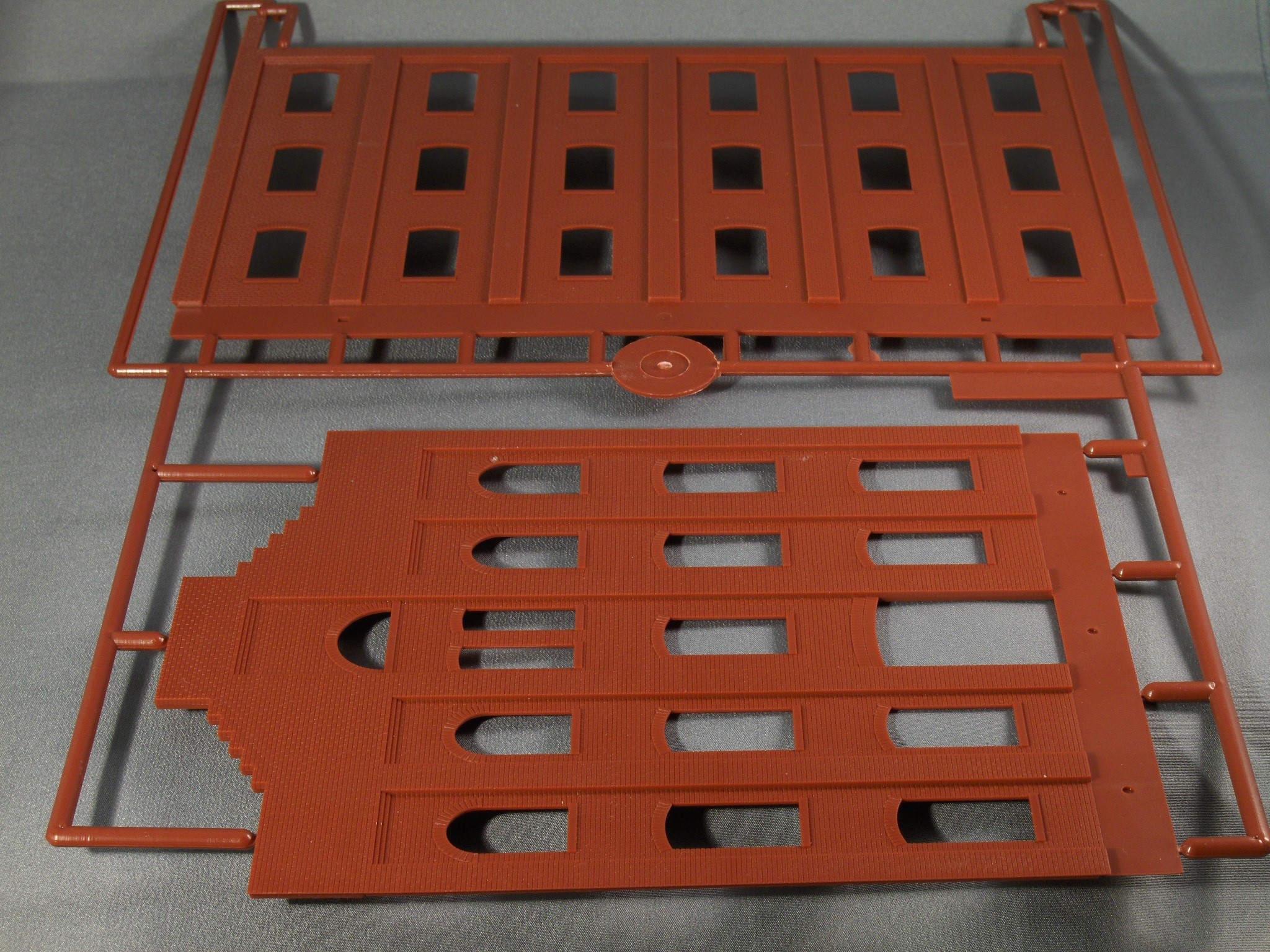
When I opened the box I discovered that there were 2 nicely detailed brick walls. The picture on the box shows the one in the foreground as the main structure. But look at the nice wall in back! I could not let that go to waste.
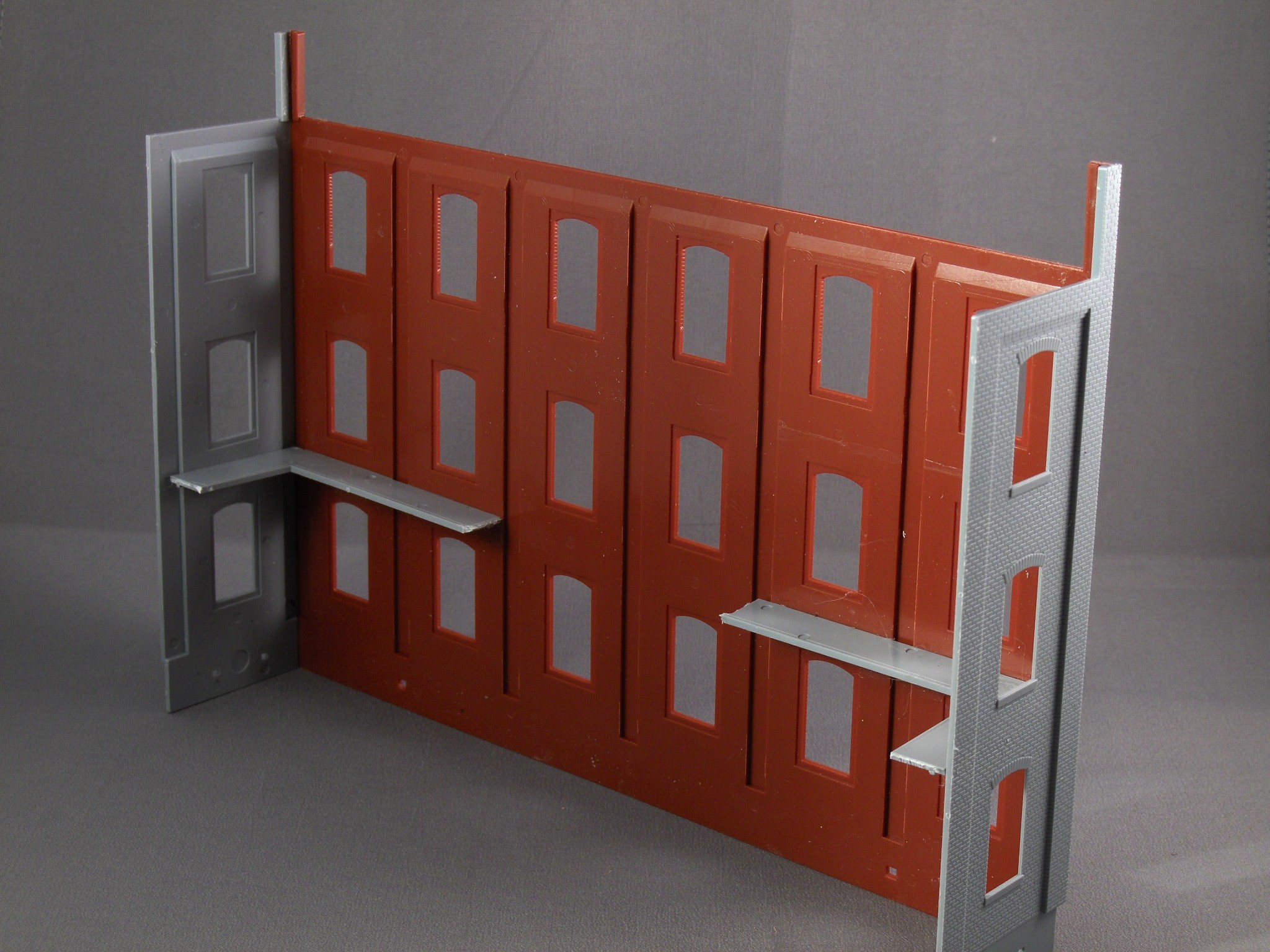
I glued the side pieces to the larger wall instead of the smaller wall to make a more interesting building, a unique one that did not look like what everybody else would build. Notice, I added right angle pieces to keep the walls square by using pieces of the original base. The building already has a substantial foundation so there is no need for the base.
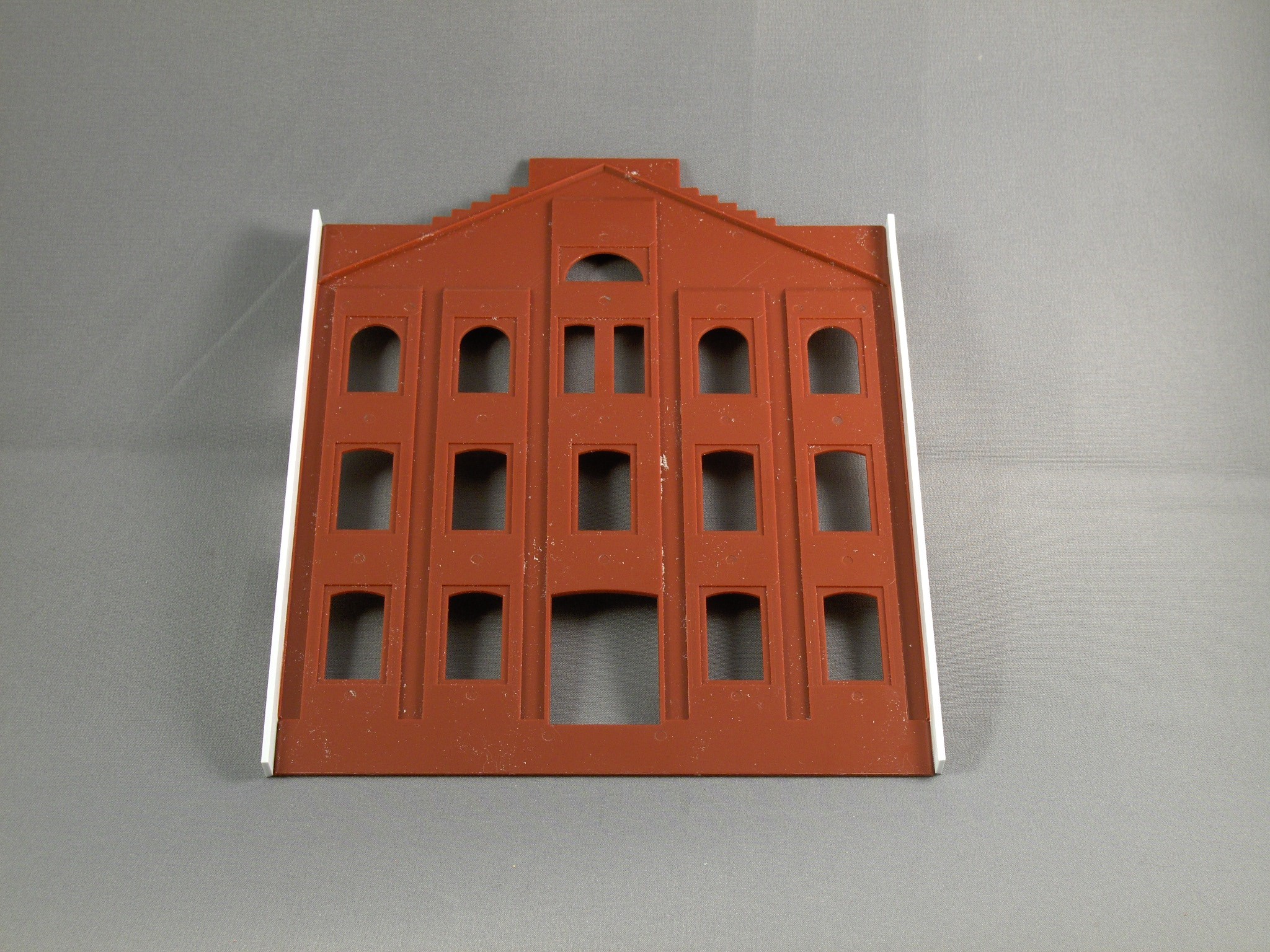
To make the smaller wall stand up and give it some depth I added styrene strips to the edges. This ensures that there will be enough room against the backdrop for the windows to clear.
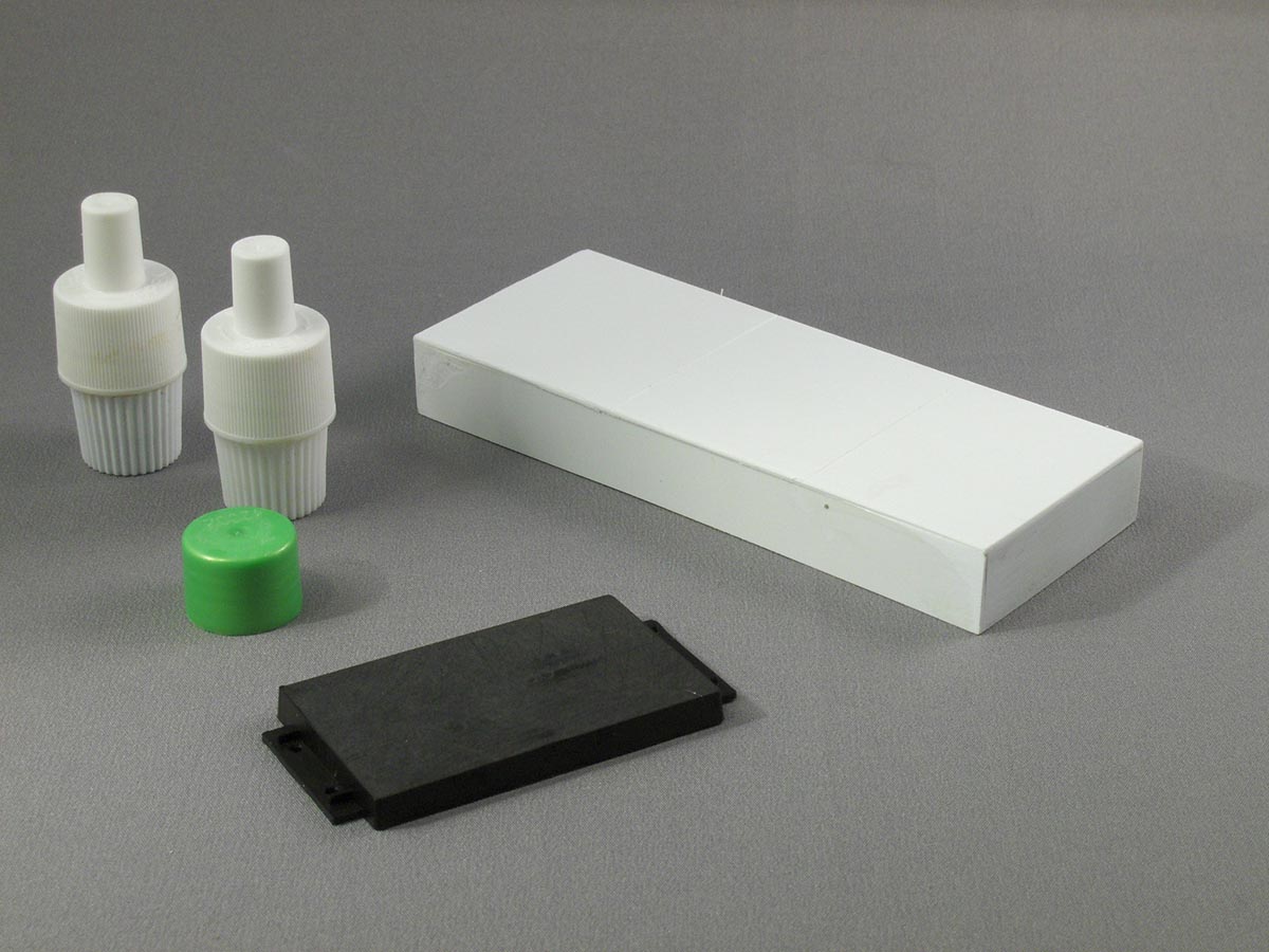
I had to add some details to the roof and make a loading dock because I wanted to recess the smaller wall and add space for the dock. I felt this would make the building more visually appealing. The items on the left are from toothpaste tubes and cosmetic tops. The black rectangle is a plastic holder for Kadee magnets. The dock was scratch built from styrene so it would fit in front of the building.
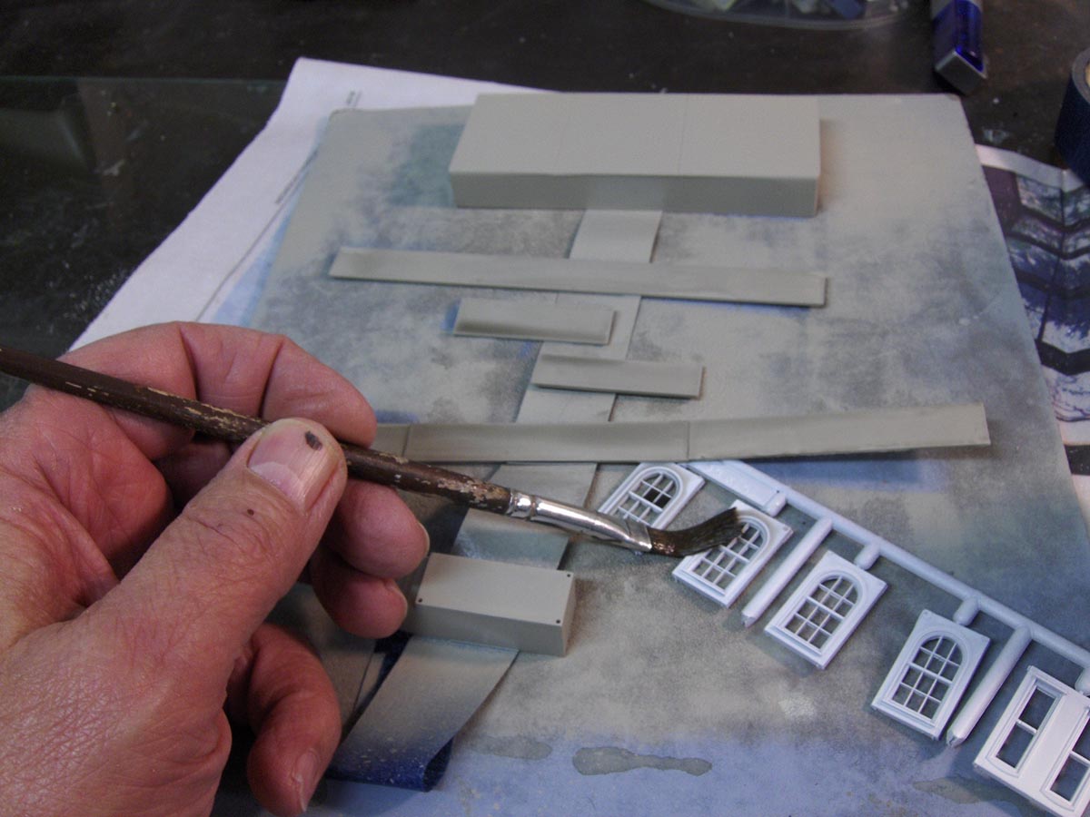
I sprayed the walls, the foundation strips in back and the loading dock with appropriate colors. The windows I sprayed with white. Here I am brushing on the alcohol and India ink wash to tone everything down. This wash was also used on the dock and the foundation pieces. Weathering is perhaps the most important thing that you can do to make your railroad look realistic. In fact, the most significant part of a model is the thin coating of color that you apply.
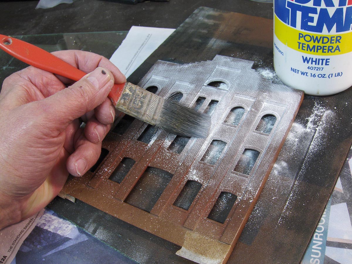
After spraying the walls red oxide, I added the mortar lines using white tempera paint powder by scrubbing it into the crevices. Right now, it doesn’t look that good, but just wait!
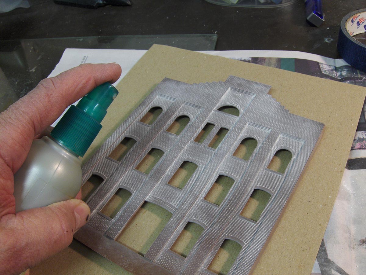
To set the paint spray a fine mist of water all over the wall. I used an old pump hair spray bottle that puts out a very fine mist. Then when it dries, I scrub the area again with a stiff brush to erase any odd water marks. This step ensures that all parts of the bricks are covered with “mortar”.
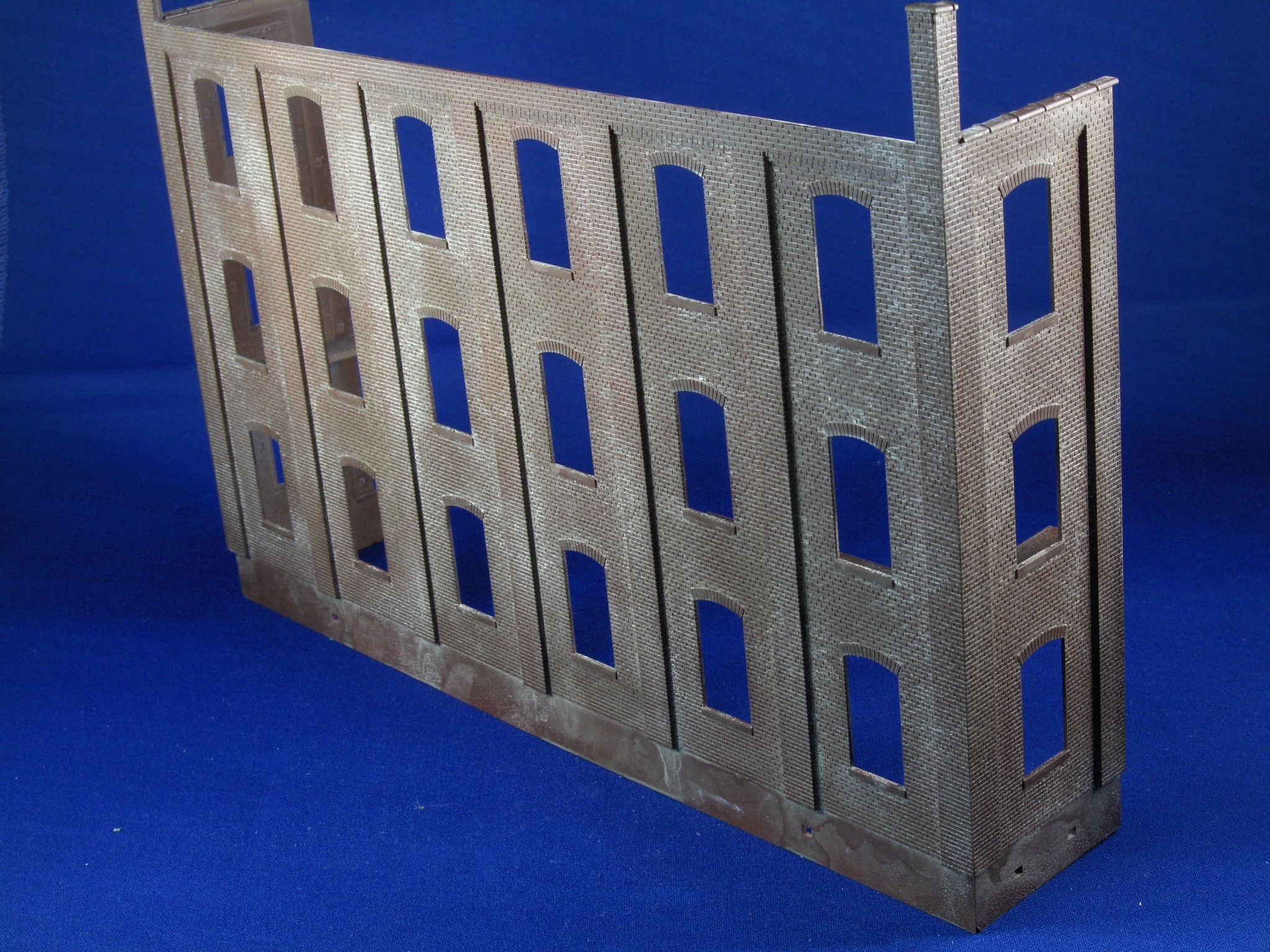
Here is how the wall looks when the treatment is finished. Notice at the top I added roof cap pieces that came with the kit. I also later painted the stone windowsills a gray color to set them off from the brick.
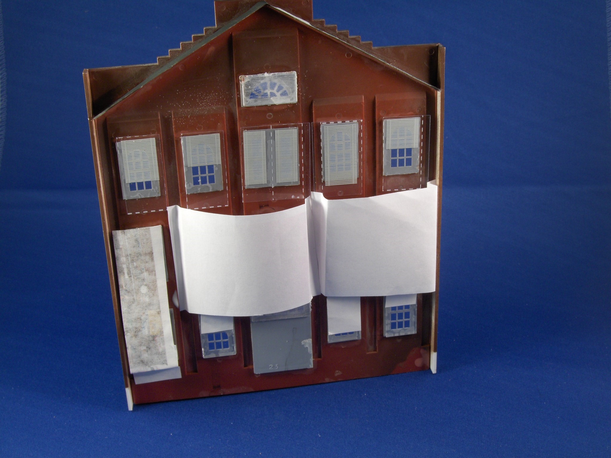
Here the windows have been added along with window glazing. I used some commercially printed plastic blinds to give the office area a “lived in” look. Below that I added pictures of interior scenes from the internet that I felt would look like a hardware warehouse. I also added this same treatment to the larger wall.
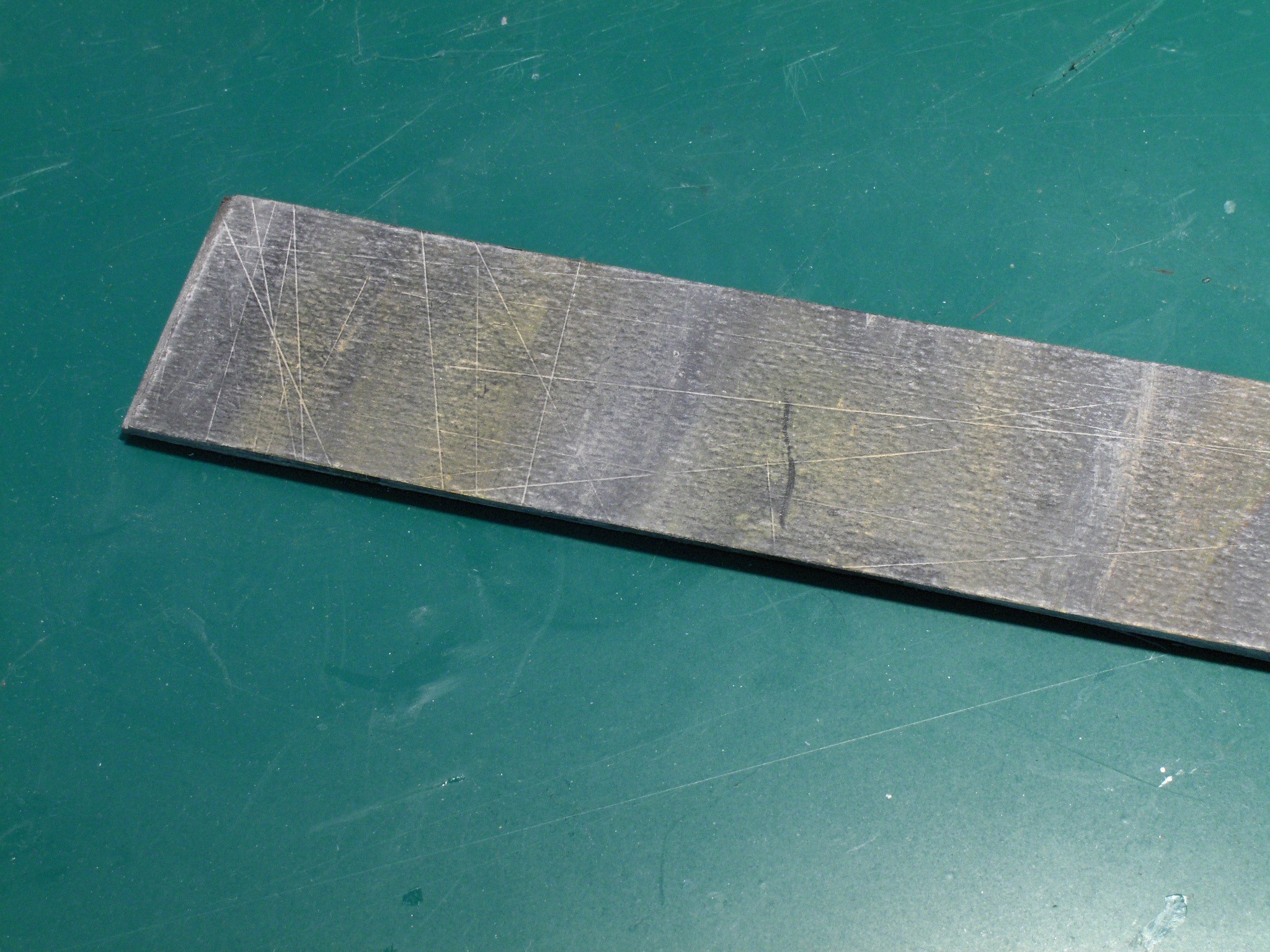
The large building needed a roof. So, I used some shirt cardboard braced with wood on the bottom, painted it black and weathered it with orange, white and gray chalks. So now it looks like a dirty roof.
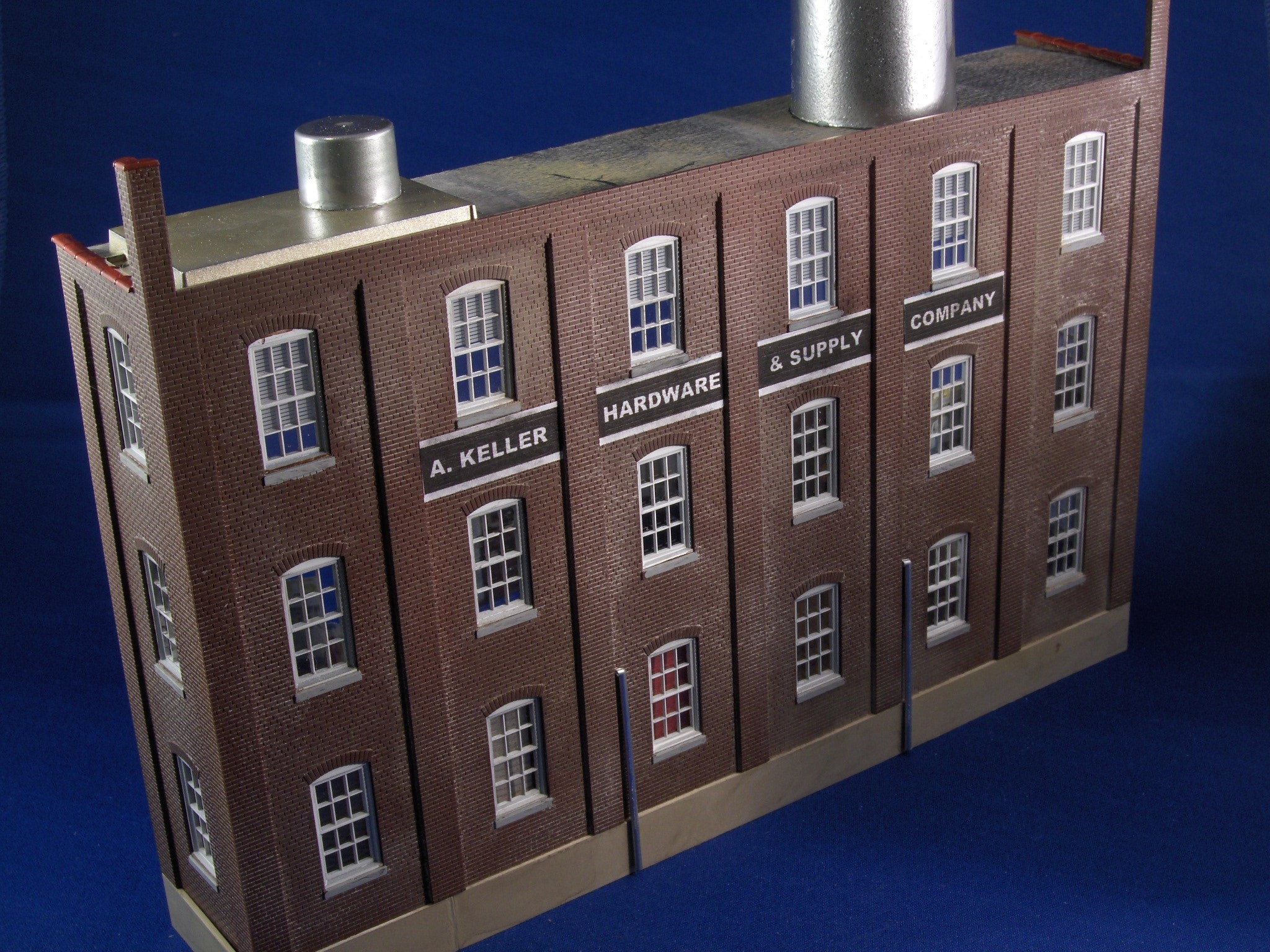
I added some parts that I showed you earlier to the roof and printed out a sign for the building. Curt wanted it named after me, I guess. Notice the gray concrete foundations have been added and some piping left over from another kit helped add some interest to the front. The foundation strip on this structure was made from some styrene sheet and cut to fit.
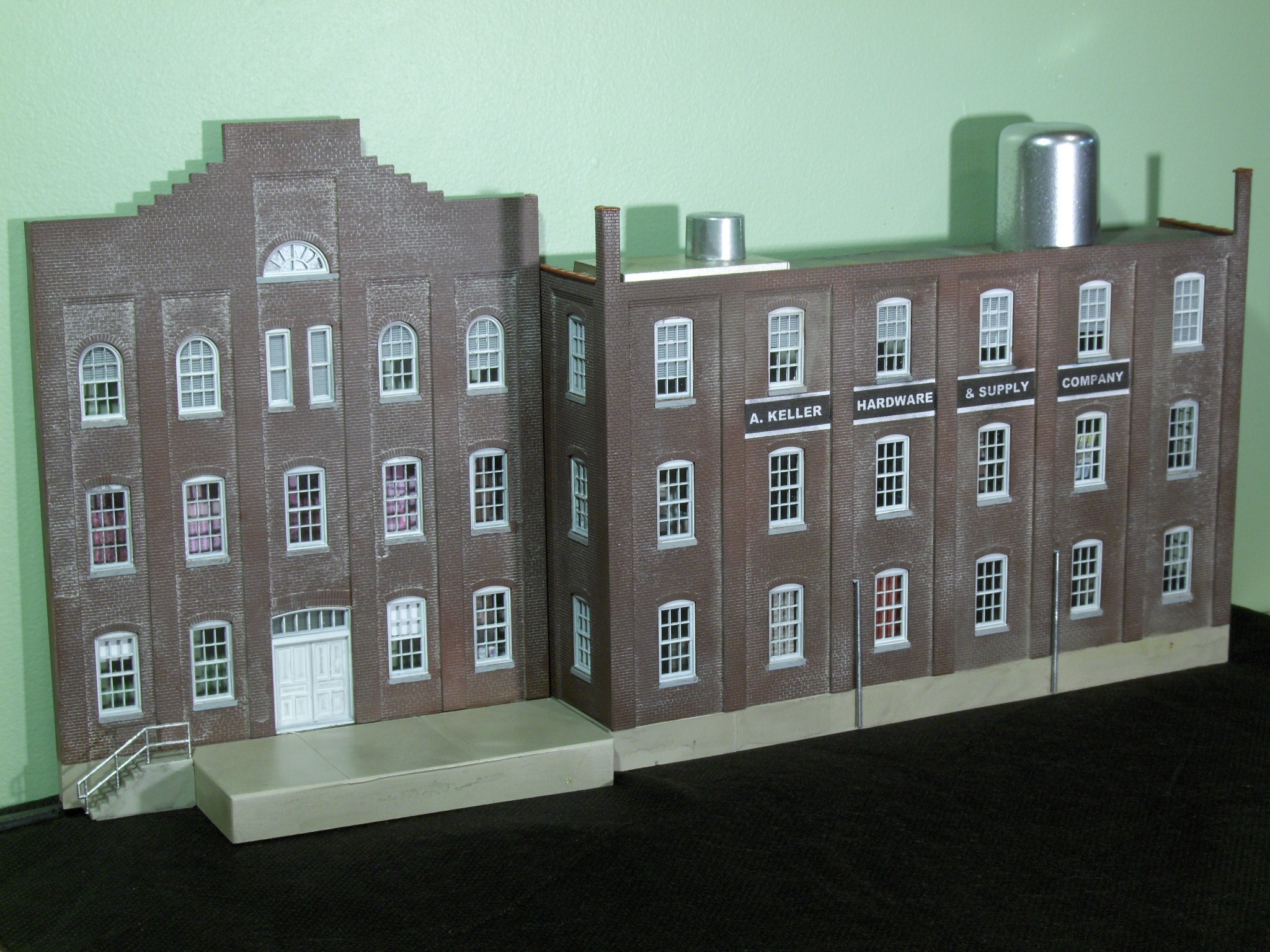
This is the completed hardware supply company ready to receive and ship freight on Curt’s layout. The smaller building has a roof of styrene strips covered with paper to simulate tar paper. Notice how the windows appear to have something behind them thanks to the printed pictures.
I'm new at this. This project has been very helpful!! Thank you!
This article has been great for a new project I am onto at the moment.
Great looking buildings!